

Introducing KITSCHEN
CANNOPY's new culinary arts series scores restaurants not on the food but on everything around it — and we want you to pick the first place we profile
There is a school of thought that separates fine dining from fine art, that draws a line between the canvas and the cutting board, the gallery wall and the chalkboard menu. We don’t buy it. Kitsch has spent too long as a term of dismissal—a shorthand for the sentimental, the excessive, the unserious — and we think it’s time to take it back. At its best, kitsch is the art of making people feel immediately, viscerally at home: through colour, through abundance, through the unashamed embrace of the things that bring us joy sans apology.
Introducing KITSCHEN: our living postcard to the restaurants, cafés, and culinary spaces that understand this instinctively—where the menu is a design object, the plating is a composition, and the room itself tells you something true about the people who made it. No stars, no rankings. Just the spaces where someone cared enough to make the whole thing beautiful.
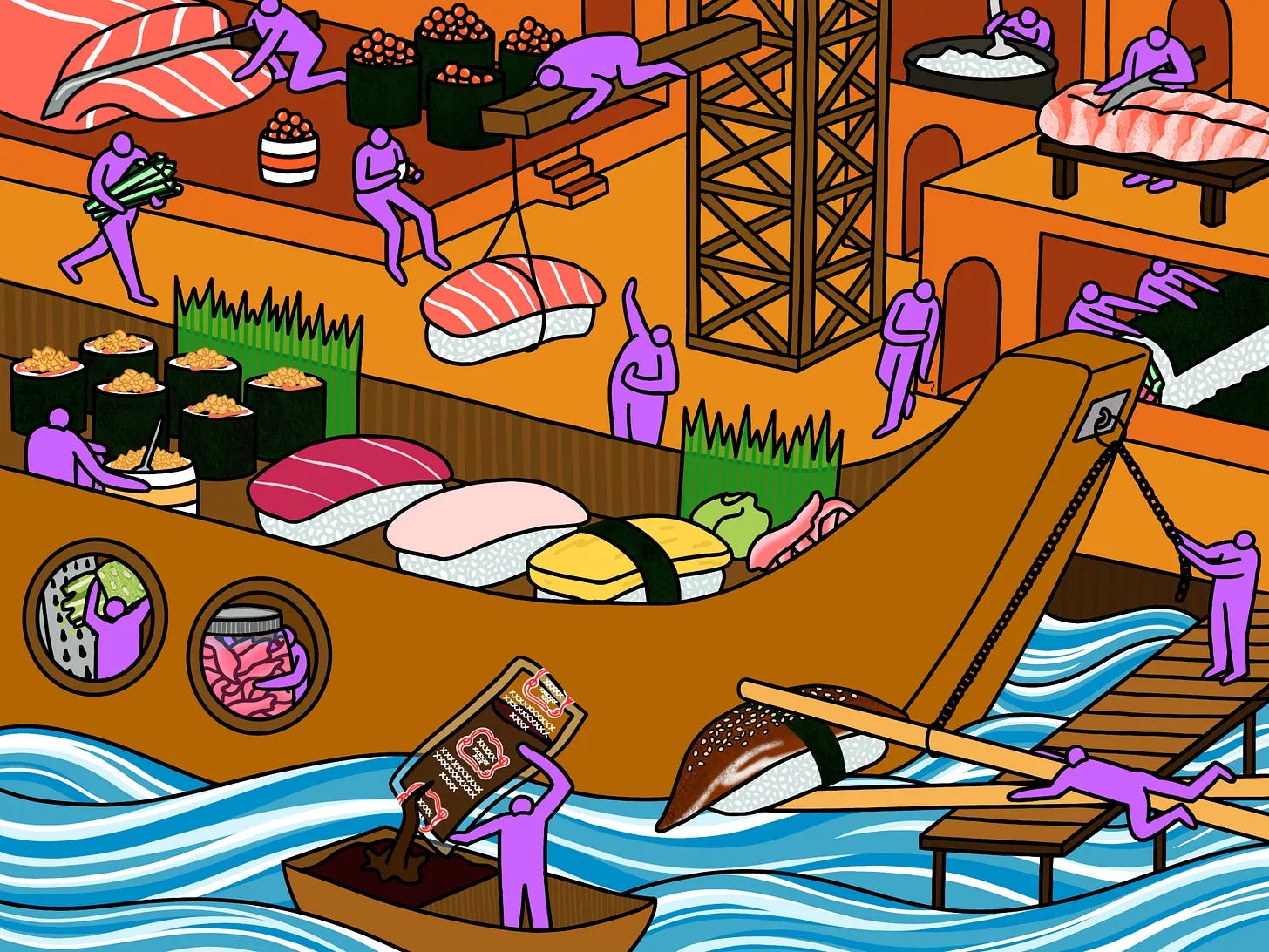
[DISCLAIMER] One thing we’re not doing here is critiquing the food. That’s serious business, it requires a budget we don’t have, and frankly we’ll eat almost anything if it makes us feel good. Food is food and art is art—food as art is where the trouble begins, and we’d rather leave that conversation to someone else. What we’re interested in is everything around the culinary event: the room you eat in, the music you eat to, the menu you hold in your hands, the wall you stare at while you’re waiting for your order. The experience that holds the meal.
KITSCHEN is here to dissect that experience.
Our Rating Criteria
MENU — design, typography, materiality, and whether it tells you something about the place before you’ve ordered anything
INSIDE & OUT — from the first impression made on the sidewalk to the last thing you notice on your way out the door. Signage, facade, and streetscape presence; layout, furniture, lighting, and colour palette. Whether the outside prepares you for the inside, and whether the inside delivers on that promise.
WALL SPACE — art(!!), objects, ephemera, and what the walls reveal about the sensibility of the people behind it.
SOUNDTRACK — the music playing, its volume (!!), its fit, and what it adds or subtracts from the room.
RASA — Borrowed from the Sanskrit word (रस) for “juice, essence, or taste,” Rasa captures the overall essence of the place: how loose it feels, how welcome you feel walking in, and whether the experience is built for everyone or only for people who already know the password. This is the most important element. We are not here to celebrate the economically segregated or the deliberately intimidating. A high Rasa score means the place has soul that doesn’t cost extra—that the thought and care put into the space translates into an experience that is genuinely, unpretentiously open. A low Rasa score means the design is doing more gatekeeping than inviting, however beautiful it might be.
Our Rating System: THE PLÄTE
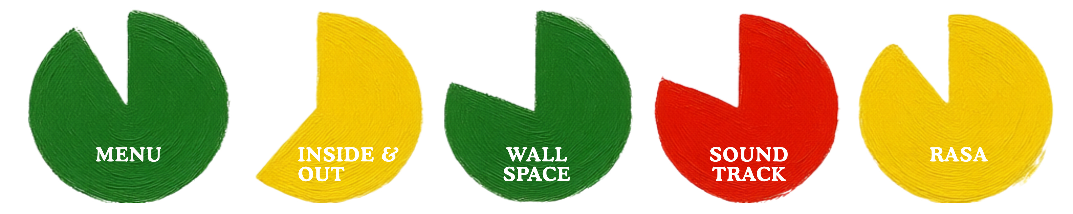
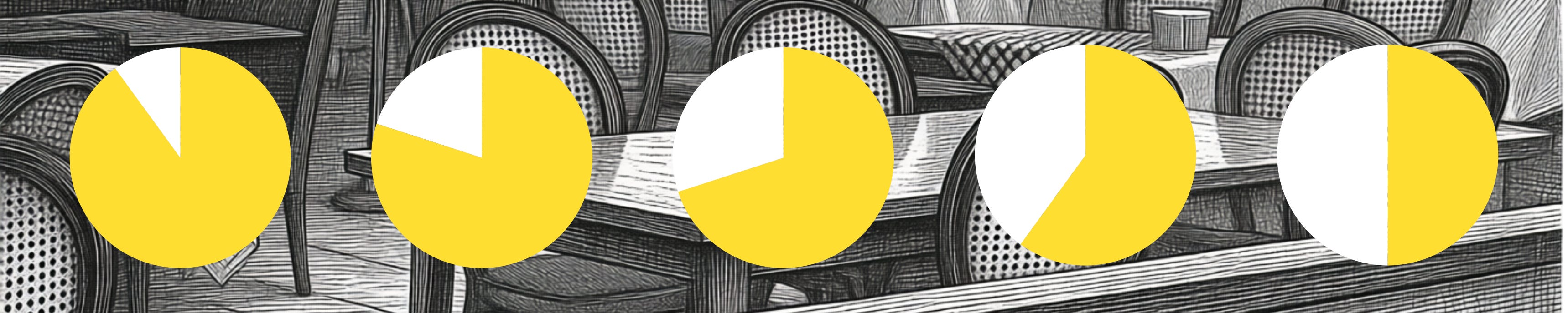
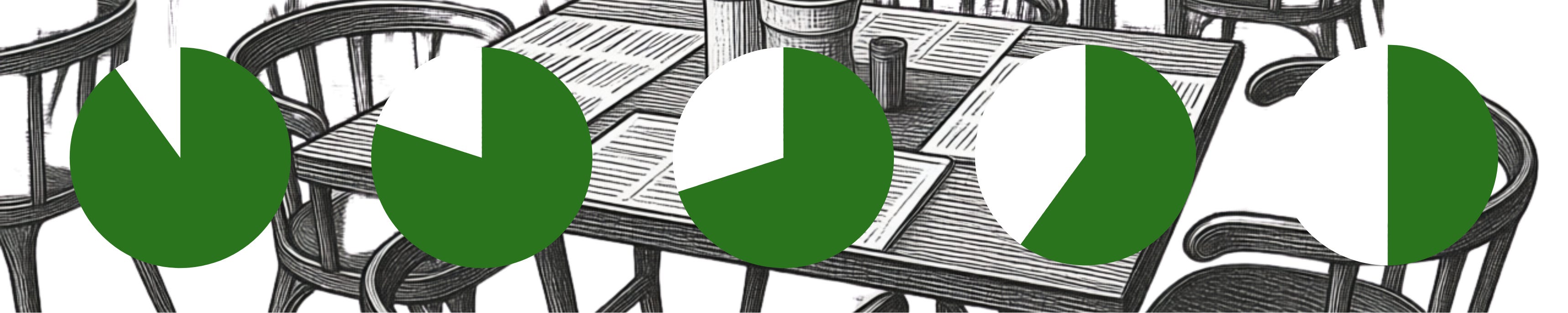
Each KITSCHEN profile is scored across our criteria using a pie graph system we’re calling The Pläte. The fuller the circle, the more we’d eat — and the more we appreciate the thought that went into it. The colour tells you if it’s what we ordered. Each of our criteria—Menu, Exterior, Interior, Wall Space, Soundtrack—receives its own Pläte, so you can see exactly where a place earns its place at the table and where it doesn’t.
Red — Stop: Not our cup of tea, but we respect the commitment. A red Pläte at 80% means it’s doing exactly what it set out to do—we’re just not buying it. But if this is your thing, you’re going to love it.
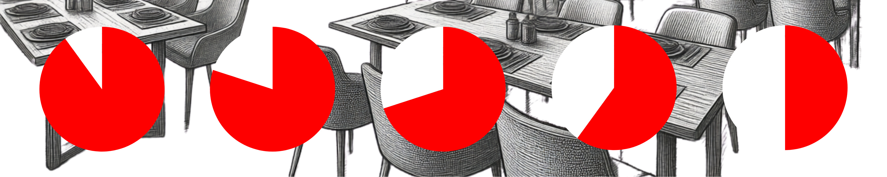
Yellow — Pause: An acquired taste. We needed a moment, a second visit, maybe a friend to convince us. A yellow Pläte at 80% means the vision is almost fully there—we’re just not quite sold, hovering at the edge of being convinced. A yellow Pläte at 30% means we’re still at the door, coat still on, not sure we’re staying.
Green — Go: Hell yes. “Spectacular, give me 14 of ‘em right now!” A green Pläte at 90% means we walked in, understood immediately, and didn’t want to leave. This is the one we’re telling everyone about. A green Pläte at 30% means the instinct is right but the execution hasn’t caught up yet—the bones are there, the ambition is legible, and we’re rooting for it.
[ANOTHER DISCLAIMER] The Pläte system doesn’t rank restaurants against each other—that’s so last year. Instead, it maps the relationship between intent and execution. A full red circle and a full green circle are equally valid. What matters is whether the place knows what it is, commits to it completely, and makes you feel something when you walk in. That’s art. That’s always worth writing about.
Cast Your Vote for the First Profile

